01 –
Understanding the problem
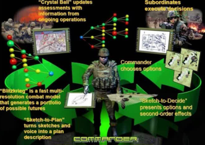
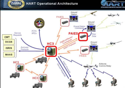
A new artificial intelligence system that would help battle planners in the U.S. military was being created to improve the effectiveness of troops meeting their objectives. They needed a way for the system to display information to planners that was quick and intuitive and made figuring out the correct approach as efficient as possible.
CONSTRAINTS
Due to the rigorous testing laptops go through before being deployed, there were often older machines still operating that the application had to run on. Since the tool would occasionally be used outdoors, the UI has to be able to handle a variety of visibility conditions.
PROJECT TIMELINE
The design had to be finished in two months and handed over to the McDonnell Douglas team that was integrating it with the artificial intelligence system.
02 –
Taking The Right Approach
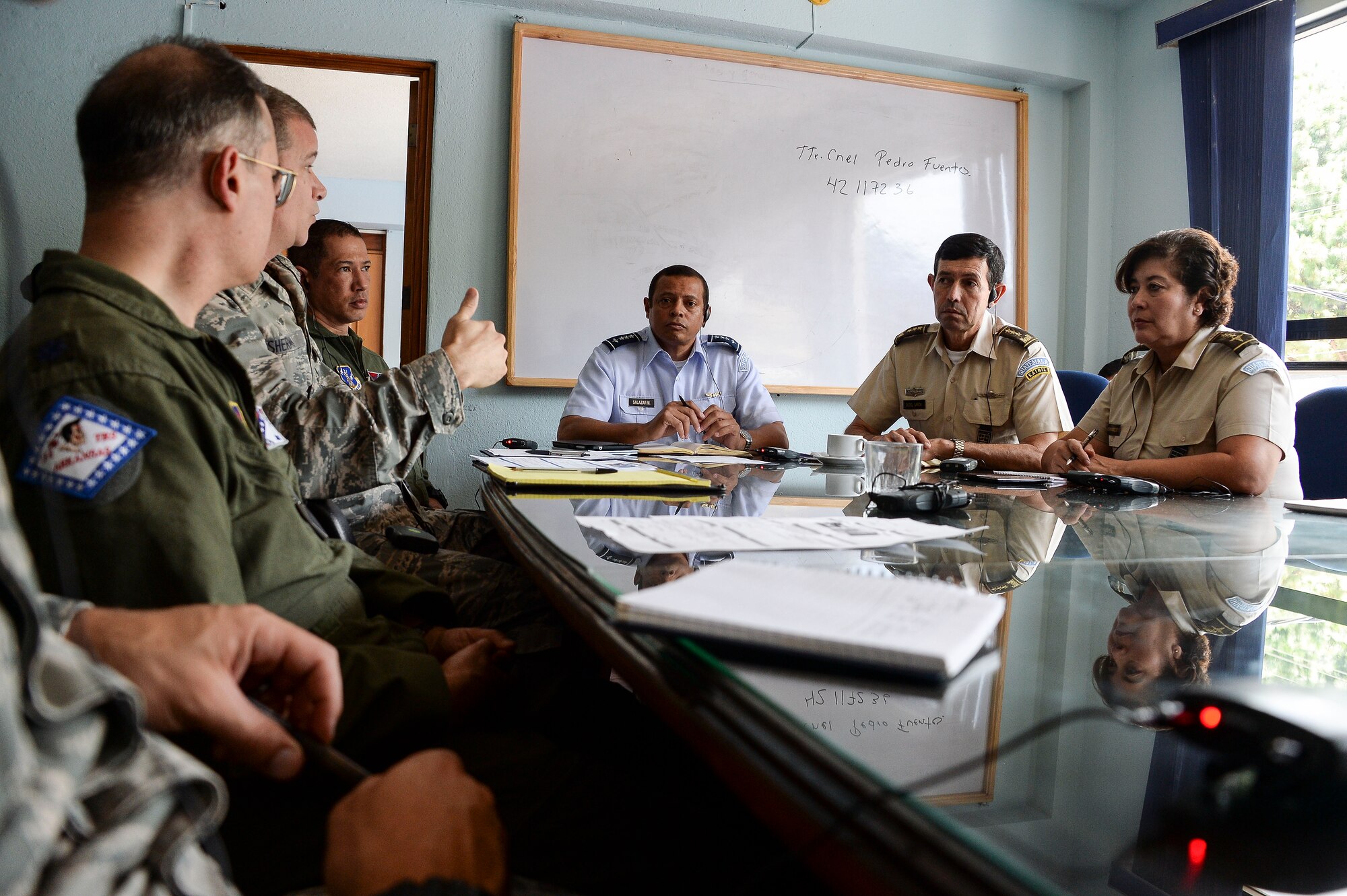
I recruited a number of subject matter experts (SMEs) who were either ex-military planners who worked with battle planning systems in the past; or who were active analysts in the military.
We discussed how planners make decisions and what they consider a success or failure when an operation unfolds.
They shared dozens of sample plans they’d personally worked on to show me what was typical.
Discussion with analysts and other SMEs in the military
Example battle planning iconography/symbols
I immersed myself in the unique iconography of military maps by reading dozens of catalogs of military topographic elements.
I presented rough drafts of the proposed user interface to SMEs, who loved it.
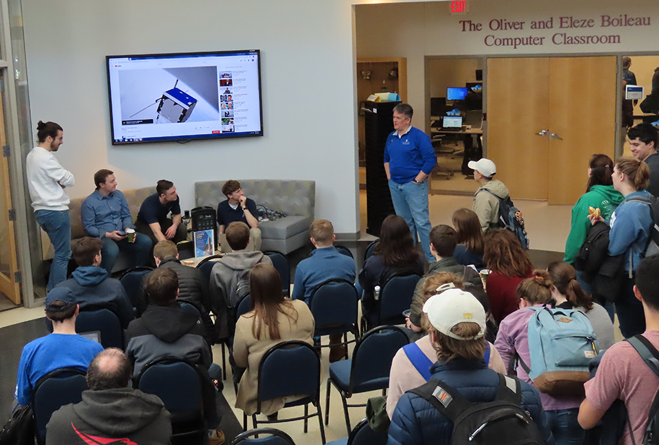
Iterative design presentation with military project leaders
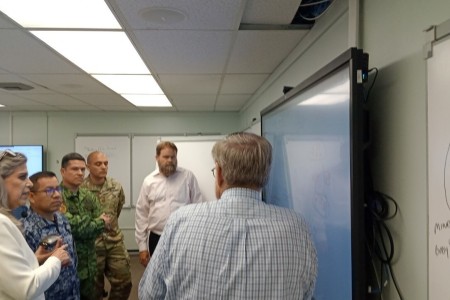
Presentation to the McDonnell Douglas team who integrated their predictive system: “Crystal Ball”
Working closely with the SMEs and the team from McDonnell Douglas, we went through five major iterations of the design.
The final designs themselves were finally signed off by all stakeholders including the DARPA contract coordinators.
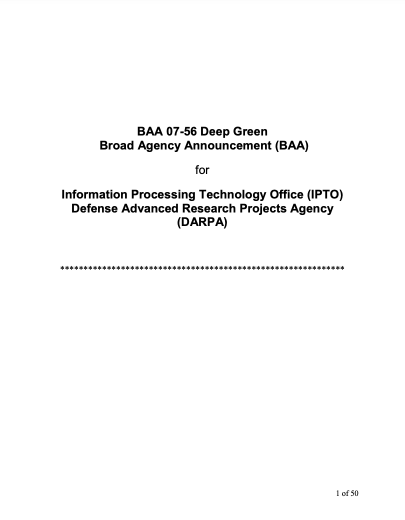
The awarded DARPA contract
03 –
Final Results
The designs were a huge success and brought my employer— Charles River Analytics— millions of dollars in contract money. Though a DARPA contracting company receiving only a portion of a contract with the rest going to another company was previously unheard of, that’s what happened here. This is a testament to my designs, since, though DARPA went with another company for the bulk of the work, they couldn’t not use my team for the UI.
[FINAL USER INTERFACE DESIGNS CONFIDENTIAL]


