CASE STUDY
Vista Higher Learning: Dashboard and Navigation Redesign
Designed for

01 –
Understanding the problem
Vista Higher Learning creates web based software tools for schools to teach foreign languages. The dashboard of their main product, SuperSite, was not very intuitive due to poorly selected iconography, layout, and color contrast. It also appeared dated and didn’t utilize the entire screen.
The structuring of the menus were poorly designed and difficult to understand due to the ambiguity of menu titles.
CONSTRAINTS
The number of structural changes possible to the underlying code was limited due to restrictions to time and resources.
The project contained a plethora of stakeholders across a wide number of different departments, with each needing to sign off on the final designs.
There was a tight, three-week deadline to reach finished, developer-ready designs from scratch.
PROJECT TIMELINE
Three weeks for the dashboard redesign.
Five weeks for the menu restyling and restructuring.
02 –
Taking The Right Approach
Looked over the UIs of all our competitors to see how they structured and styled their dashboards and menus.
Noted what markets their styles trying to convey to consumers. Conservative, modern, easy-to-use, etc.
I discussed with the product manager what style direction would allow us the greatest strategic advantage in the marketplace considering competing products.
A collection of competitor dashboard UIs

An example of the original dashboard interface

Quizzed the project stakeholders for constructive feedback on their likes and dislikes regarding the current dashboard and navigation.
Walked through the current UI in a focus group style setting, and took notes on any specific issues with UI elements and areas that needed improvement.
Discussed the navigation categorization with key stakeholders and fielded suggestions for improvements.
Ran a ‘Crazy-8s’ exercise with twelve of the stakeholders and developers. This enabled the sharing of knowledge from each group, and helped form a better understanding of any specific technical or feature constraints.
Set up a design board in Figma that could be worked on collaboratively with up to a dozen participants.
Invited stakeholders from the development, design, and product management teams to spend 90 minutes in a Crazy-8s session alongside subject matter experts.
Paired the participants into six groups of two to work together and brainstorm eight different ways they could approach the problem.
Had the pairs return to the main group to share their solutions and rationale. The “cross pollination” of ideas was then passed on to the pairs who were provided with another opportunity to brainstorm independently, before presenting to the broader team.
The typical flow of a Crazy 8s session

A sample of the resulting output from the online session

Styles collection

Gathered dozens of samples of different styles available online as inspiration for the direction we wanted to take the product.
Picked a color pallet based on color samples found on other pages in the application. We wanted the new design to fit within some of the general stylings of the older pages in order to form an experience for the user that was a cohesive whole while we transitioned to a new look and feel.
Color wheel showing a complimenting color triad.

A section of the inner-workings of the dashboard’s prototype design

Created an interactive prototype for the new dashboard that would allow for usability tests of the application with participating users, as well as better presentation of how the new layout would function in production.
03 –
Final Results
The sales and marketing team, as well as all the other stakeholders in the company, were in love with the final product. It was met with rave reviews by the teachers as well as the rest of the company.
Several sales representatives said that customers who were considered “very hard to please” were blown away by the visual appeal and how easy it was to navigate. This helped to land some multi-million dollar renewals as well as new business.
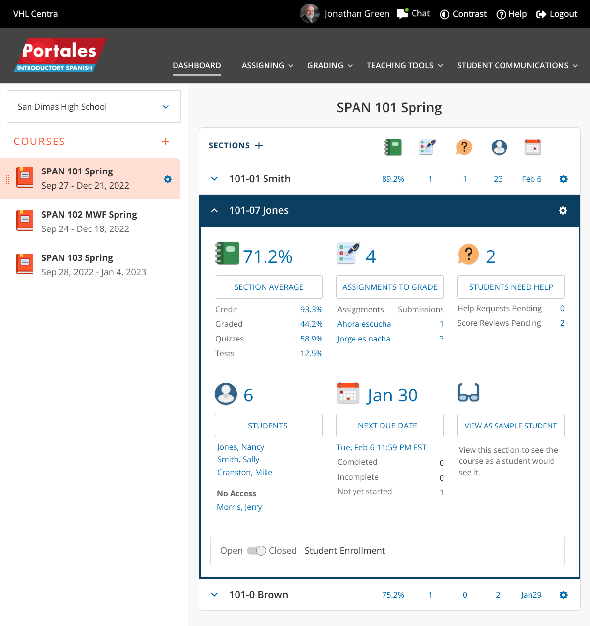
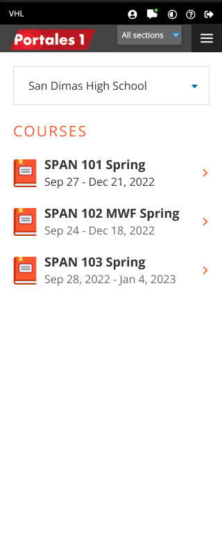
Dashboard for desktop
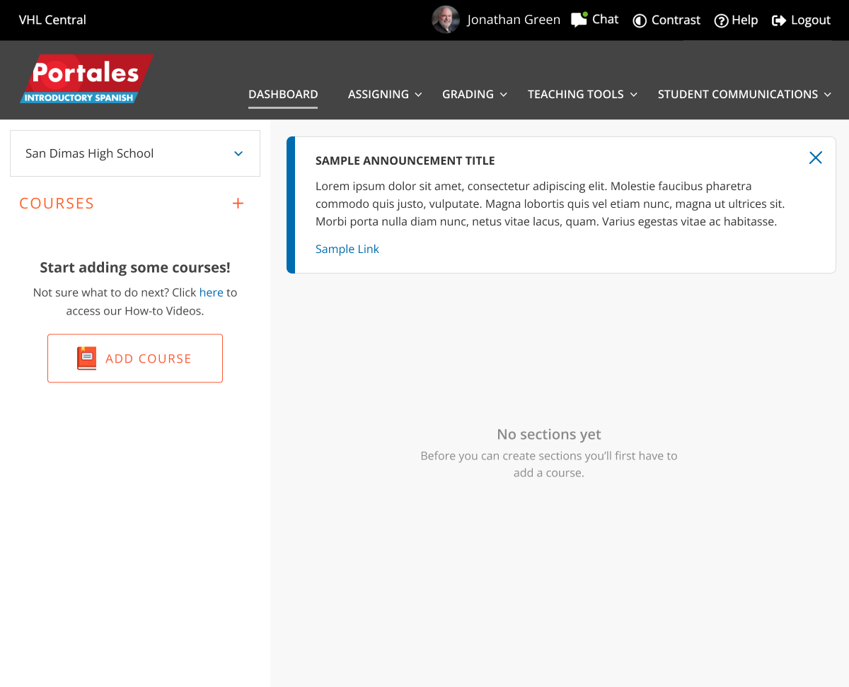
Dashboard empty state
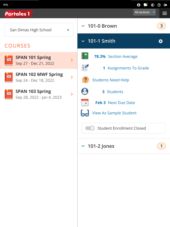
Dashboard for tablet
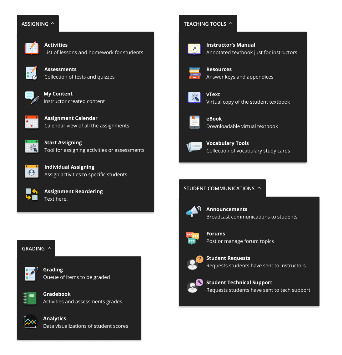
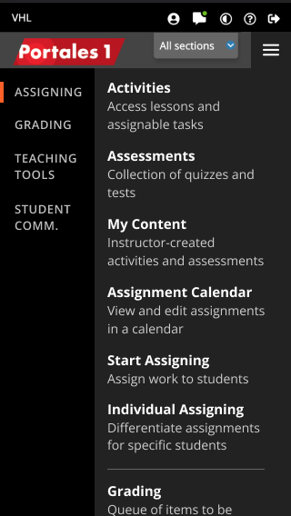
Final menus for desktop
VHL-Final-dashboard-mobile-1
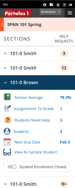
Dashboard for mobile