01 –
Understanding the problem
Validity was formed as a company with the goal of creating tools that CRM (customer relationship management) administrators could use to better manage their data to improve marketing performance. The main product they would produce first was the “Trust Assessment” that would give CRM users an accurate sense of what the quality of their data was and how to approach improving it.
CONSTRAINTS
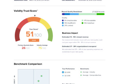
The visuals on the final report had to be compelling for demonstration purposes.
The graphs in the application had to clearly exhibit the meaning of some fairly complex concepts.
The final assessment had to be brief and digestible while simultaneously being thorough enough to merit the $15,000 price tag.
PROJECT TIMELINE
Create the completed design from concept to completion in under ninety days so it could be turned into a working product in three months time.
02 –
Taking The Right Approach
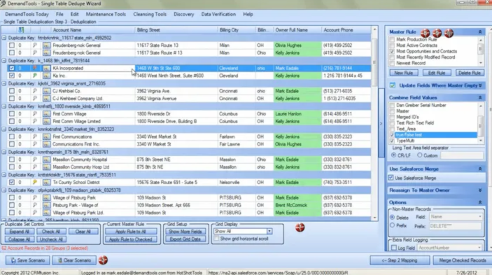
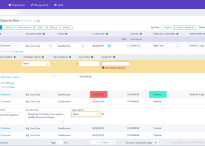
Gathered UI samples from the prototypes developers created prior to my arrival to better understand the problem and the data that would be visualized in the final product.
Sample of inherited UI
Frequent collaboration meetings with stakeholders
Talked with the two product managers assigned to the project (lead and support) to better understand what the requirements were and what would be considered a “win” on launch.
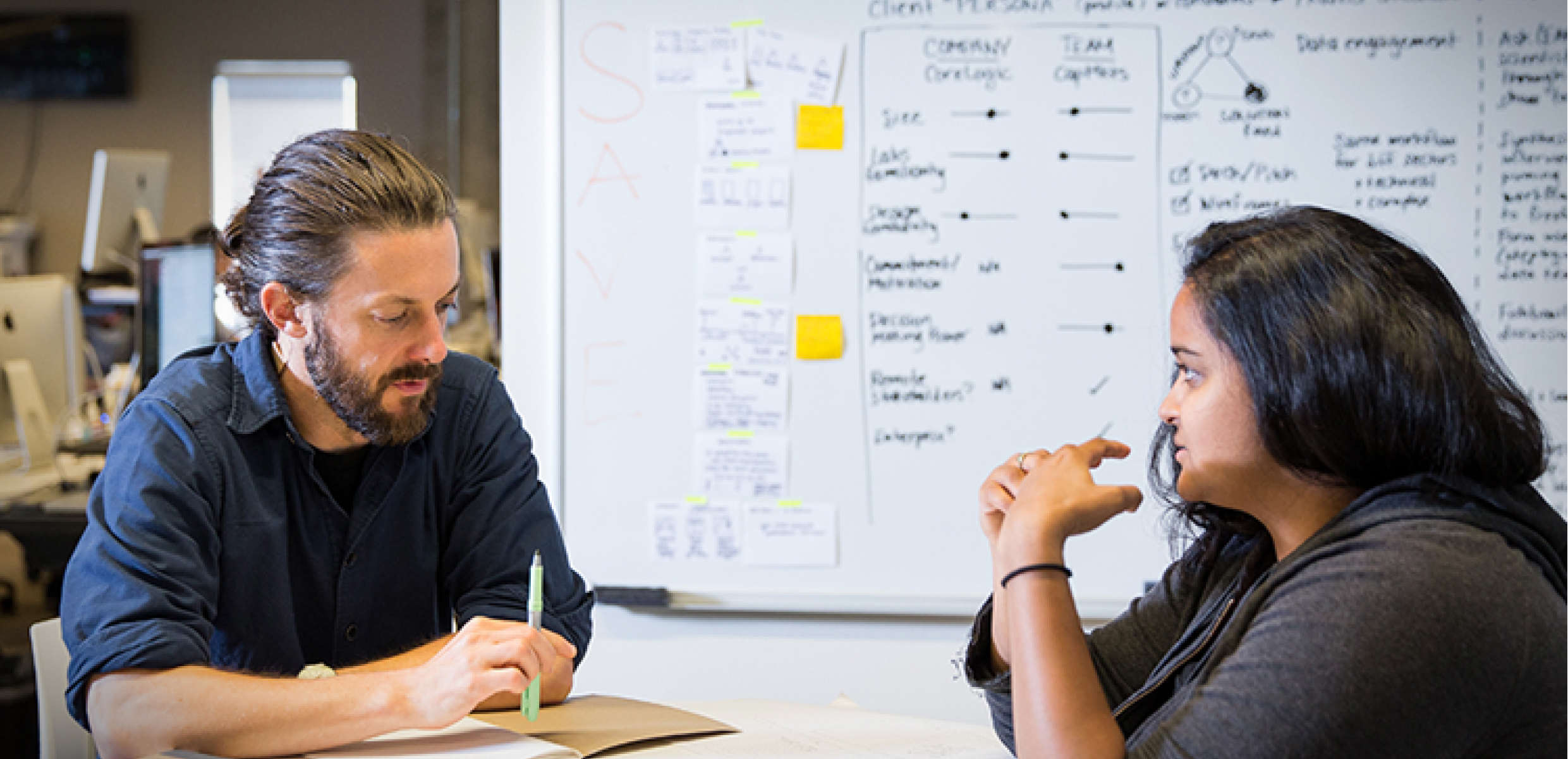
Conducted one-on-one interviews with customers and discussed their current process for CRM data reporting and how it could be improved.
One-on-one customer interviews
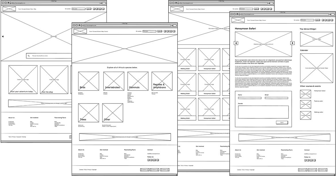
Low fidelity wireframe collection
Produced low fidelity data visualization as talking-pieces then used them to gather input from the team.
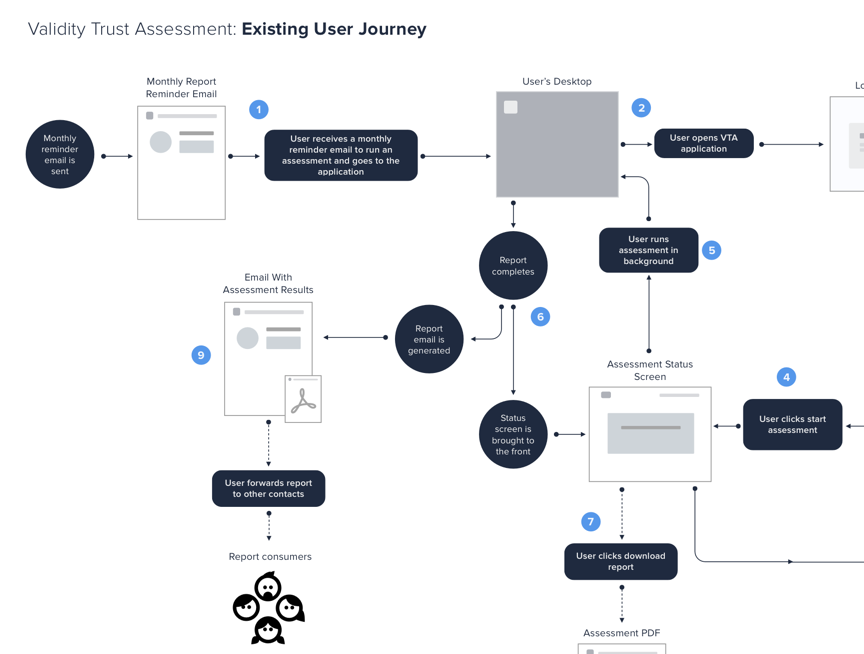
Created a journey map of the future product to help the CEO and other stakeholders better understand the final implementation.
Proposed journey map
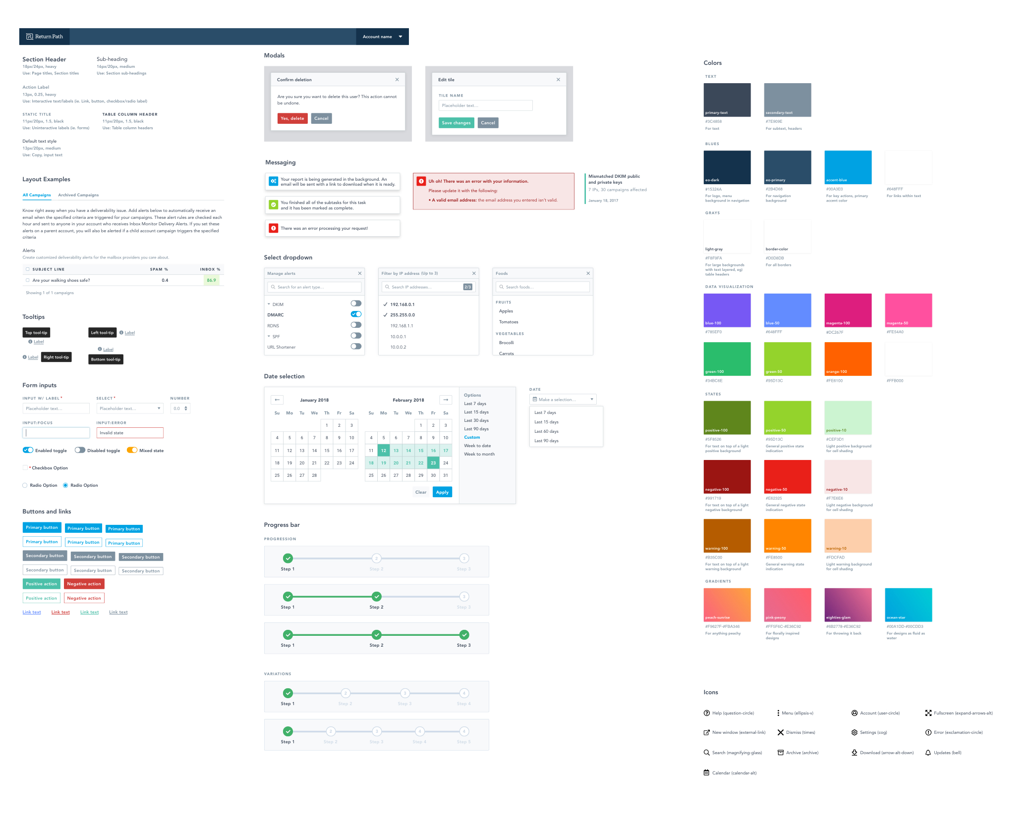
Components with brand guidelines
Worked with the marketing team to make sure the UI and report styles were consistent with our brand guidelines. Then cross checked the quality of the interface’s aesthetics with the head of the marketing design team.
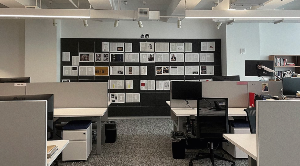
As new versions of the different report pages and the application user interface were created, I posted paper printouts of them in the main room of the office for everyone to comment on and reference as they walked by them.
Regularly updated report design on the wall for office wide reference and feedback
Designs with developer and PM feedback
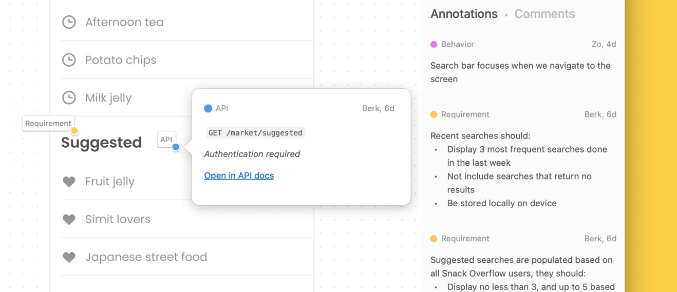
Shared the final version of the application online with the development team using Zeplin where they could inspect the elements to gather the CSS and other design elements necessary for the completion of the interface.
Walked through the intention of the experience and design elements with all stakeholders prior to handoff.
Responded to the comments placed on the design via Zeplin and made adjustments as necessary.
03 –
Final Results
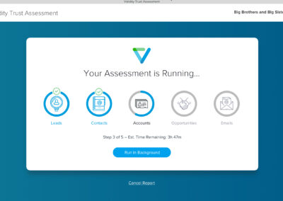
When the first version of the application was released, the CEO called a meeting of the entire global staff to extol the virtues of the final result, emphasizing how happy he was at the quick turnaround. The product was the first piece of software Validity created in-house, and became their flagship.
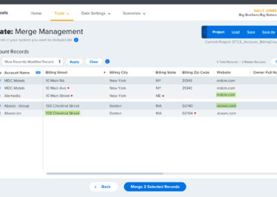
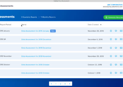
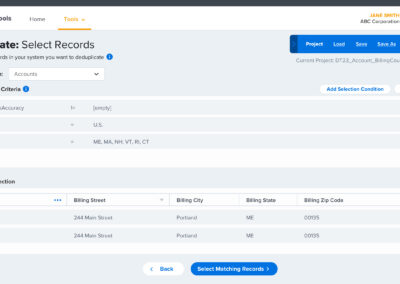
To this day the executives at Validity point to the CRM analysis software we created as its greatest design achievement.


